
Why Are Nutrition Labels So Confusing?
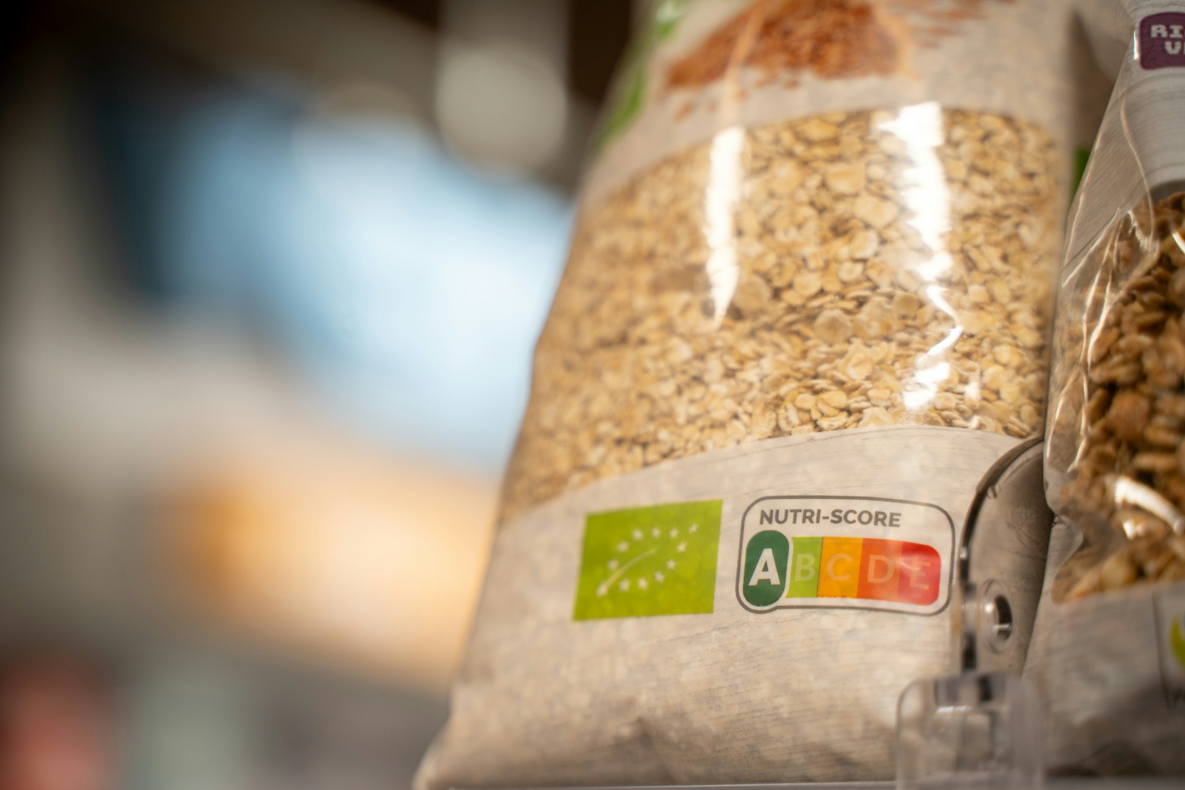
Nutrition labels are confusing because using one properly means doing arithmetic: multiplying by servings, and working percentages against a daily total that isn’t yours. In a US national survey of 3,165 adults, carried out in 2013 and published in the CDC journal Preventing Chronic Disease, 41% could not work out what share of a stated 2,500-calorie day one serving of ice cream would take up.
In brief
- The FDA's own shortcut skips the maths: 5% Daily Value or less per serving is low, 20% or more is high.
- In that 2013 survey of 3,165 US adults, 42% couldn't subtract one serving's saturated fat from a daily total, and only 54% of graduates got all four label questions right.
- %DV is calculated against a 2,000-calorie reference day, which the FDA states is a general guide rather than anyone's actual requirement.
- In a 2018 survey of 21,586 adults in five countries, how well people thought they understood labels barely matched how well they scored on a test of it (r = 0.16 to 0.18).
Why are nutrition labels so confusing?
Because a nutrition label doesn’t tell you what you want to know. It hands you the raw materials and leaves you to work it out, standing in an aisle with a basket in one hand.
To use one you have to find the serving size, check how many servings are in the pack, multiply, then compare the result against a daily total you may not know. That’s three or four operations before you reach anything useful, and the research finds people coming unstuck at each of them.
What does percent Daily Value actually mean?
Percent Daily Value tells you how much of one day’s recommended intake of a nutrient sits in one serving. If a serving shows 20% DV for saturated fat, that’s a fifth of the day’s reference amount for that nutrient.
The FDA publishes a shortcut that skips the arithmetic:
| %DV in one serving | What it means |
|---|---|
| 5% or less | Low in that nutrient |
| 20% or more | High in that nutrient |
| The reference day | 2,000 calories, which the FDA calls a general guide, not your requirement |
Source: US Food and Drug Administration, checked 16 September 2026.
That table does most of what the percentages are there for. The catch is the reference point: the FDA says the 2,000-calorie figure “is used as a general guide for nutrition advice” and adds that “your calorie needs may be higher or lower and vary depending on your age, sex, height, weight, and physical activity level.”
Not every Daily Value works the same way, and this is the part that’s easy to get backwards. The ones for total fat, saturated fat, carbohydrate, fibre and added sugars are derived from that 2,000-calorie reference, so they’re the percentages that assume a day you may not be having. Others like sodium, calcium, and the vitamins are fixed population figures that don’t scale with how much you eat at all. And calories themselves carry no %DV on the modern US label, they’re given as a plain number.
How many people struggle with nutrition labels?
Enough that it’s better understood as a design problem than a personal one.
Alexander Persoskie, Erin Hennessy and Wendy Nelson analysed four label-reading questions put to 3,165 US adults in a nationally representative survey run in late 2013, publishing in the CDC journal Preventing Chronic Disease in 2017. Every question used the same ice-cream label.
| What the question asked | Got it wrong |
|---|---|
| How many calories in the whole container | 24% |
| How much ice cream makes up 60g of carbohydrate | 21% |
| Daily saturated fat left after dropping one serving | 42% |
| What share of a stated 2,500-calorie day one serving takes up | 41% |
Source: Persoskie, Hennessy & Nelson, Preventing Chronic Disease, 2017; 3,165 US adults surveyed in 2013.
Two findings here pull in different directions and the gaps between groups are wide. Among people without a high-school diploma, more than a third answered none of the four correctly. That inequality deserves stating rather than smoothing over, labels work least well for the people with the least slack. But education doesn’t solve it either. Among people with a four-year degree, only 54% got all four right.
Those figures come with two caveats. It was a mail survey with a 35.2% response rate, and the authors note respondents may have had help from someone else, which would make everyday performance worse than these numbers rather than better.
An earlier study catalogued which steps fail. Russell Rothman and colleagues gave a 24-question food-label test to 200 primary care patients in 2004–05 and measured reading and maths skills separately, publishing in the American Journal of Preventive Medicine in 2006. Nearly everyone (89%) said they used food labels. Three-quarters had finished high school and 77% scored at a ninth-grade level on a standard reading test, but only 37% scored at that level on the maths test (those are research scoring scales, not statements about anyone’s schooling).
Maths skill tracked comprehension more closely than reading, education or income did, though these were simple correlations in 200 patients at one clinic, and reading skill tracked it fairly closely too. Both matter. The authors were explicit that strong readers still struggled.
Their catalogue of what went wrong is the practical part:
- Misapplying the serving size. The bottle you’re drinking is not the serving on the label.
- Distraction from everything else printed on the packet. Most of it isn’t the number you need.
- Plain calculation errors. Multiplication, standing up, in a hurry.
Does this work the same way if you’re eating more?
It goes wrong in both directions, which needs saying, because nearly everything written about labels assumes you’re trying to eat less.
If you eat 1,600 calories a day, the calorie-scaled percentages, saturated fat, carbohydrate, fibre, and added sugars are describing a bigger day than yours, so a serving takes up more of your allowance than the label suggests. At 3,000 to gain, it’s the reverse. The label can’t know which, so it uses the middle figure and leaves the adjustment to you. That adjustment is a version of the sum 41% of that survey sample couldn’t do.
Do colour labels work better than numbers?
There’s reasonable evidence that they do, though, as you’ll see, it rests on people’s own account of how well they understand them.
Jasmin Bhawra and colleagues surveyed 21,586 adults across Australia, Canada, Mexico, the UK and the US in late 2018, as part of the International Food Policy Study, publishing in the Journal of Nutrition in 2022. Their conclusion, “Nutrition labels requiring greater numeracy skills… were more difficult for consumers to understand than interpretive FOP labels.” People reported understanding the UK’s traffic lights and Australia’s health star ratings better than Mexico’s numeric Guideline Daily Amounts.
A colour or a star rating gives you the conclusion; a percentage asks you to reach it yourself.
The same paper then undercuts its own front-of-pack result, and this is probably the most useful number in the article. The researchers also gave people an objective test of the nutrition panel, not the front-of-pack label. How well people said they understood labels barely matched how they actually scored, a correlation of 0.16 for front-of-pack understanding, and 0.18 for the panel. People are poor judges of whether a label is working for them.
So take the traffic-light finding as real but soft. The study contains no objective test of front-of-pack comprehension at all, and its panel test draws on the same underlying instrument as the 2013 US survey above, which makes the two less independent than they look.
Two further limits. Understanding a label isn’t the same as changing what goes in the trolley, and the evidence on whether front-of-pack labels shift what people buy is more mixed than the comprehension evidence. And understanding varied by income and education here too, the same inequality showing up again rather than being solved.
Have the labels got any better?
They have, and it changes how you should read everything above, because two of those studies describe a label that no longer exists in the US.
The FDA redesigned the Nutrition Facts panel, requiring compliance from January 2020 for larger manufacturers and January 2021 for smaller ones. Several changes answer these failures directly. The calorie figure and the serving size were enlarged and bolded. Serving sizes were updated to reflect what people actually eat, so ice cream went from ½ to ⅔ of a cup and soda from 8 to 12 ounces. And many containers people finish in one go are now declared as a single serving, a 20-ounce bottle of soda among them, which is the exact item Rothman’s hardest question was built on.
So that question, where only a third could work out the carbohydrate in a 2.5-serving bottle, describes a sum today’s US label removes for that product: the bottle is one serving, so there’s nothing to multiply. The relief is narrower than it sounds, a 1-litre or 2-litre bottle is still multi-serving, a tub of ice cream still holds several, and the percentages still assume a 2,000-calorie day rather than yours. Bhawra’s data was also collected before the compliance deadline. We haven’t found post-redesign comprehension research at the same scale, so treat these figures as evidence that format matters rather than as a current scoreboard.
What to do about it
If you want more out of labels without turning a shop into a maths test:
- Check servings per pack first. It’s the most common place the sum goes wrong and the quickest thing to look at.
- Use the 5% and 20% rule instead of calculating. Low and high, no multiplication.
- In the UK and EU, compare per 100g rather than per serving. Serving sizes vary between brands and 100g doesn’t. US labels don’t carry a per-100g column, so this one doesn’t travel.
- Lean on front-of-pack colours where you have them. UK traffic lights do the interpretive work the research suggests people find easier.
- Don’t treat any of it as exact. US regulations let declared calories, sugars, fat and sodium run up to 20% above the figure printed on the label, restaurant figures drift further still, and a kitchen scale fixes less of this than you’d expect.
It’s also fair to say this is learnable. Sally Moore and colleagues reviewed 17 studies of programmes teaching label use in Nutrients in 2018, and every one reported a significant improvement in at least one measure — though a review where every study is positive is also one to expect some publication bias in, and the size and durability of the effect aren’t established.
The numbers were never the point. They exist to get you to a decision, is this a lot, should I have something else, am I roughly on track, and the arithmetic in between is a cost you pay on the way.
That’s why Ori has a setting called Stealth Health, which hides the calorie and weight figures and gives you the guidance in plain sentences instead. The supermarket aisle isn’t where it helps; that’s between you and the packet. The moment afterwards is, when the question turns into what to do next and most apps answer with another set of numbers to interpret. If that’s the part you’d rather not do, it’s the part Ori is built to take off you.
We’ve also written about what happens when calorie counting starts making things harder, and about the gap between what people think they ate and what they ate.
Sources
- US Consumers’ Understanding of Nutrition Labels in 2013: The Importance of Health Literacy — Preventing Chronic Disease (Persoskie, Hennessy & Nelson, 2017) — 3,165 adults, nationally representative US mail survey run September–December 2013, 35.2% response rate
- Patient understanding of food labels: the role of literacy and numeracy — American Journal of Preventive Medicine (Rothman, Housam, Weiss, Davis, Gregory, Gebretsadik, Shintani & Elasy, 2006) — 200 primary care patients at a single site, cross-sectional, data from 2004–05
- Correlates of Self-Reported and Functional Understanding of Nutrition Labels across 5 Countries in the 2018 International Food Policy Study — Journal of Nutrition (Bhawra, Kirkpatrick, Hall, Vanderlee, Thrasher & Hammond, 2022) — 21,586 adults across five countries; front-of-pack understanding was self-reported, and self-reported understanding correlated with tested understanding at r = 0.18
- Effect of Educational Interventions on Understanding and Use of Nutrition Labels: A Systematic Review — Nutrients (Moore, Donnelly, Jones & Cade, 2018) — 17 studies, heterogeneous outcome measures, mostly US
- How to Understand and Use the Nutrition Facts Label — US Food and Drug Administration — the 2,000-calorie reference and the 5%/20% guide, checked 16 September 2026
- Changes to the Nutrition Facts Label — US Food and Drug Administration — redesign contents and compliance dates, checked 16 September 2026
- Food Serving Sizes Get a Reality Check — US Food and Drug Administration — serving-size changes and single-serving containers, checked 17 September 2026
- 21 CFR 101.9 — Nutrition labeling of food (eCFR) — which Daily Values derive from the 2,000-calorie reference, and the compliance tolerances on declared values, checked 17 September 2026
Related reading
- Is Calorie Counting Bad for Your Anxiety? — when the numbers themselves are the problem
- Are Restaurant Calorie Counts Accurate? — the same figures, one step less regulated
- Why Do I Always Underestimate How Much I’ve Eaten? — what happens after the packet goes in the bin
A gentle safety note
Ori supports general wellness. It is not medical care. If you have a history of disordered eating, are pregnant or breastfeeding, take medicines that affect weight or appetite, or have a clinical nutrition need, speak with a qualified healthcare professional before changing your intake or weight goal.
Read Ori's Health Disclaimer